WACCI 137 Index - Home Page www.wacci.org.uk
| 01 - Thanx & Stuff | 02 - Fair Comment | 03 - New Generation | 04 - Exploring the PSG |
| 05 - Programmers' Patch | 06 - CPC Changed My Life | 07 - Cartography |
With the right art package, you can create attractive maps on your CPC, as Richard Fairhurst explains
One respondent to the WACCI reader survey said that they'd like an article about making maps on their CPC. As chance would have it, I've recently been getting into all things cartographical, recently enjoying a day at the Society of Cartographers' Summer School. So here's a brief exposition of simple cartography and how you can do it on your CPC.
The British Cartographic Society's website proclaims that "Cartography is one of two professions in the world that is still fun". I'm not sure what the other one might be, but the point still holds.
This is because cartography is as much a creative art as an information science. No map, after all, can ever be a 100% accurate representation of what lies on the ground: if you wanted that, you'd use an aerial photograph. You'd have to scale the photograph down to a manageable size, of course - and in doing so, you'd make details like footpaths, streams and mini-roundabouts too small to be discerned.
That's the art bit: devising a scheme by which such small features are included on your map. The science is in ensuring that the map remains as accurate as possible, not deviating from what the map user will find 'on the ground'.
But such decisions lie in the future. Let's start from first principles - how do you research your map?
Plagiarise, plagiarise, remember why the Good Lord made your eyes. But always call it research," as the great Tom Lehrer once said (sang, probably). Fine advice - except if you're a cartographer.Before you draw your map, you have to know what it is you're going to draw. It sounds obvious. But you can't draw a road, for example, without knowing where it starts, where it ends, and how it bends between those two points. You could just guess. But then you'll end up confused when you start adding more intersecting roads, and find they don't meet in quite the places you expected them to.
The easy solution is to get the tracing paper out and 'borrow' the lines from an Ordnance Survey map. Don't. The OS is famously litigious, and recently landed the AA with a multi-million pound legal bill for borrowing such data for use in its own road atlases. The AA's downfall came because the OS, like other cartographers, footprints its maps - adding small, deliberate errors to entrap the unwary plagiarist.
You could buy a GPS set. These whizzy little boxes will tell you where you are in the world to an accuracy of several metres. That way, you can trace the co-ordinates of key points along a road, draw them on a grid, and join the dots to get your map of the road. Foolproof, accurate, but laborious.
Or you could borrow the data from an out-of-copyright source. Copyright usually expires 70 years after the death of the author, or (in the case of a map produced by a company) after the end of the calendar year in which it was produced. With OS maps, however, it expires only 50 years after the end of said year, so you can use any maps produced in 1950 or earlier. Not a lot of use if you're mapping the M6, but fine for local roads, railways, canals, and the positions of towns and villages, none of which have changed much.
All of this is a lot of hassle, and if you're just producing a map for friends, the parish newsletter, WACCI, or what-have-you, you're probably best off just guessing.
Seventy years ago, the apprentice cartographer Phyllis Pearsall was wrestling with a fearsome card index listing every street in London. 'Mrs P' had decided that London needed a street atlas. Getting hold of the maps was not a problem: she chose to 'borrow' them from the Ordnance Survey (and yes, she did get clobbered for it).
But that only got her a load of lines on a sheet of paper. A street atlas names the roads, and equally importantly, indexes them alphabetically, so you can find where it is you're supposed to be going. In 1933, Phyllis Pearsall needed a card index. But today, she'd do it by computer.
Computers have transformed the field of cartography. Geographical Information Systems are huge databases of points on a map, including those which form discrete entities (such as a church or phone box), areas (such as city boundaries), and lines (such a road or river). From this database, the computer can draw the map itself. And from the same database, it can automatically generate an index.
Of course, a skilled cartographer is still needed to add the "art". A simple computer drawing from a GIS database would probably be messy, cluttered, and difficult to use. The cartographer's job is to tell the computer how to make a map from the database, by deciding how much detail to include, what style to draw each piece of information in, what scale to use for the map, and so on. Should towns with a population over 10,000 have their name in bold type? Should rivers be included at all? What colour should the roads be? Should north be at the top of the map? These are the decisions that have to be made.
Here lies another great benefit of the GIS approach. You only need to do the research once. From then on, you can create any number of different maps, just by altering the instructions you give the computer.
As an example that some of you might have seen, take RoutePlanner. It draws a (very) simple road map on screen to illustrate your chosen route across Britain. The map isn't stored as an Art Studio picture, or anything like that. Rather, RoutePlanner has a database of 5000 towns and road junctions in its memory. For each town, it stores its co-ordinates on a nationwide grid, together with a list of the roads that emanate from there, and where they go to. The map is automatically drawn from this information.
It's a very rudimentary map (the PCW version looks a little better). All the roads are straight lines: all the town names are displayed in capitals. But have a play, and you'll see that the basics of a GIS are in there. When you've zoomed in to the greatest extent, you see B roads, A roads, the lot: but when you've zoomed out to fit the whole of England on one screen, you only see the motorways.
At the other extreme, the Ordnance Survey has recently embarked on a project called the Digital National Framework, whereby the whole of Britain will be tabulated in one big GIS. Their computers will then generate each map automatically, drawing each feature according to a set of instructions (or what they're calling a Style Guide).
But even if you're drawing a map by hand, you still need to make decisions on what you're going to include, and how you're going to depict each feature. As an exercise, take a few maps of your local area - perhaps a road atlas, an OS Landranger map, and a street plan - and see how they differ.
By now, you should be able to understand that maps are designed, that you have to sit down and work out (say) whether you want to show churches on a four-miles-to-the-inch road atlas. (You probably don't.)
But that's not the end of the artistic bit.
Maps lie. Take a glovebox road atlas, and measure the width of a sample A road - probably a couple of millimetres. Now multiply its width up by the scale of the map. It looks like it's a quarter of a mile wide, and that's not actually true even of the M25.
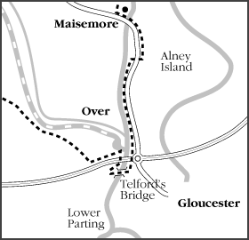
Now turn to the page showing the South Wales valleys. You'll probably find three roads running parallel up each valley, a railway, a river, maybe a derelict canal, and a load of houses. When put next to each other, the map probably shows them as a mile or two across. Fine. But the valley isn't really that wide.The map-maker has distorted the geographic surroundings of the valley to fit everything in, at the expense of less valuable information - such as the countryside on the ridge either side. You probably haven't noticed this before. You almost certainly wouldn't notice while using this road atlas for the purpose for which it was intended. Now that's an art.
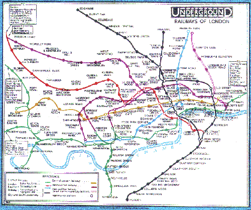
This process of altering the lie of the land to aid legibility is called generalisation. The ultimate example is the Underground map. This bears little relation to the above-ground geography of London, or to the distance between stations - but for getting around the Tube, it's much more understandable than a simple geographical representation will ever be. (Compare the earlier, less generalised version on the next page.)
Computers don't generalise very well unless told how to do it. This is one of the reasons why GIS will never completely replace the human cartographer.
This should be enough information for you to decide what you want to show in your map, and how you're going to show it. So let's turn the CPC on and start to draw a map.
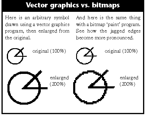
The CPC, it must be said, isn't ideally suited to the task. Maps are best drawn with 'vector graphics' programs, also known as drawing programs. When you draw a line in one of these, it records it in memory as something like "line from co-ordinates 53,10 to 83,40". When you draw a circle, it says "circle with centre 28,9 and a diameter of 10".
All these instructions added together make your picture. This has two great benefits. Firstly, you can zoom in or out of the picture without it looking jagged, because it's redrawing it to your instructions every time. (See the illustrations for more.) Secondly, you can make changes without affecting other parts of the picture. If you want to move the circle, you do so. The computer just changes that particular record to "circle with a centre at 25,6 and a diameter of 10", without affecting any of the others.
There aren't really any programs to do that on the CPC. (Model Universe does, I believe, but that's intended for a 3D environment rather than a 2D map.) Instead, you're restricted to 'paint programs' like Art Studio, MicroDesign and PowerPage. These work, as we all know, by inking in dots - or pixels - on a giant grid. If you've drawn a circle and want to move it, you have to rub out the first circle, redraw anything else that was underneath it, and then draw the new one.
In practice, this means you should draw your map on paper before you fire up your CPC.
I'd suggest MicroDesign. It's a nice MODE 2 technical drawing package anyway, easy to use and fast. It gives you a large page area to draw on. And its icons feature is ideal for pre-defined symbols which you'll want to use repeatedly, like churches, phone boxes, pubs, and picnic sites.
PowerPage 128 is efficient when you're used to it, and it has good text features for adding annotations to your map. It only draws straight lines, which isn't a lot of use unless you're mapping Roman Britain, but a succession of them together will give you a passable arc or curve.
SD Microsystems' Picasso isn't a very well-known program, but it has one feature which will aid your cartography enormously: free rotation. You can rotate an area of your drawing by any angle between 0 and 360, not just through right angles. This enables you to write road names along the roads themselves.
Art Studio, of course, is a famously capable art package capable of operating in all three screen MODEs, but its approach is better suited to freehand drawing than accurate cartography. GPaint may be a better choice if you want to use MODE 1.
Pick your MODE. MODE 2, of course, is best if you're ultimately aiming for printed output - but if you have a colour printer, or if your map will be displayed on screen, you may appreciate the colour of MODE 1.
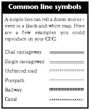
Most of your map will be drawn with straight lines and arcs. You can simply draw one line for each road or path, of course, and that will provide a basic, readable map. Many professional maps, however, use a technique known as casing. This means that the line has differently coloured edges, so an A road will be shown as green with black edges. If you're working in MODE 2, there's nothing to say that the road shouldn't be white with black edges.
There are several ways to do this. You could draw two lines, one for each edge of the road, then fill in the middle in a different colour using the Fill option on your art package. If you have the option of drawing lines of different widths, then draw (say) a thick black line to start with, then a thinner green or white line on top of it.
Don't forget that your art package may offer an option for dotted or dashed lines. These are a great way of adding meaning and differentiating between different types of road: on an OS map, for example, footpaths and county boundaries are shown with various combinations of dots and dashes. I'm sure the European constituency boundary means something very rude in Morse code.
Use a fill pattern or a different colour to illustrate areas. A fine checkerboard pattern in black and white will look like grey, and is well suited to showing built-up areas. You could even design a more complicated pattern for forests, based around a repeated tree symbol.
Choose a nice, legible font for labelling your map - ideally one without serifs (twiddly bits at the edge of letters). PowerPage comes with a good one, designed by Tim Blackbond.
If you're using MicroDesign, make full use of the icons feature for often-used symbols. But if not, you could try redefining unused characters in your font to give the symbols you require. Alternatively, just draw them at the side of the map, and copy to the right position whenever you need one.
And have fun!
As demonstrated by RoutePlanner, there's no reason why you can't implement a simple GIS on your Amstrad. A practiced BASIC programmer will be able to grasp the fundamentals easily, so I won't expound further here - except to say that I'd be fascinated to see anything that you might come up with.
With thanks to the nice people at GEOprojects of Reading, who provided much help for my mapping feature in Canal Boat magazine, December 2000, and hence indirectly for this article. My on-going railway map project can be seen at www.systemeD.net/atlas/.
The British Library in Euston Road, London, is currently showing a splendid-sounding exhibition called the Lie of the Land, illustrating how maps have deceived and misled over the centuries.
Books about cartography aren't easy to find except in the most academic of bookshops (Blackwell's in Oxford is pretty good), but if you can locate it, I'd suggest a weighty-ish tome called Elements of Cartography as a good introduction to the subject.
| 01 - Thanx & Stuff | 02 - Fair Comment | 03 - New Generation | 04 - Exploring the PSG |
| 05 - Programmers' Patch | 06 - CPC Changed My Life | 07 - Cartography |
WACCI 137 Index - Home Page www.wacci.org.uk